OOB MAGAZINE – Constructing Beauty – Part 1
Are you a makeup artist who would love to see your work published by an international magazine you respect? I’ve felt that way for a long time. Earlier this year, I traveled to Paris as a finalist for the OOB MAGAZINE and MAKE UP FOR EVER makeup competition. Did I win? No, but I achieved what I set out to do. I decided to enter the global makeup competition after seeing the work that OOB MAGAZINE was publishing. The first time I cracked open OOB Magazine, I thought… “THIS is a magazine that I identify with and I want my work published here.”
My hope was… maybe, I might be able to create a relationship to collaborate on future published projects if I compete. Luck was on my side!!! The following post is OOB MAGAZINE – Constructing Beauty- Part 1. Here’s my process and how I developed my ideas under the direction of OOB MAGAZINE’s Editor in Chief, Jabe. Thank you Jabe!!! I can’t thank you enough for this opportunity.
CREATIVE DIRECTION – BEYOND NEO MODERNISM
After returning to the US from Paris, I received an art board and inspiration directive from Jabe. The OOB directive for Issue #6 was Beyond Neo Modernism. I researched Neo Modernism for days. I delved into art, architecture, ideology and philosophy. I admit I was not well versed in Neo Modernism, however, that’s never stopped me before. The piece that interested me the most was the amazing architecture. I couldn’t get away from the idea of beautiful, modern, sculptural patterns. Shocking I know… patterns being my inspiration, LOL. The other element I found intriguing was that Neo Modernism is rooted in juxtaposition. So I would need an opposing element that felt earthy against these sculptural, modern works of art.
MOOD BOARD
I created my own mood board per Jabe’s request to ensure we were collectively on the same page. This is the art board I created.
When creating this mood board I had the idea to incorporate paper as my organic element to juxtapose the sculptural element. I started looking into origami and any type of paper art I could google. My goal was to arrive at six makeup ideas to be shot in one day. That is a huge undertaking to say the least. I love a refined makeup application and knew that if I was to go the route of sculptural architecture my looks would have to be pristine. This was going to take careful planning to pull it off.
CASTING KIERSEY CLEMONS
In the beginning stages of planning, I started thinking about “my girl”. I called longtime friend and fashion photographer, Bode Helm and his producer Holly Kissinger to see if they were “in”. Of course they were, this was going to be amazing!! They just happened to know actress, Kiersey Clemons. Really?!!! We cast her and we had one week to prepare for the shoot or we would miss our window of time to shoot her before she started her next project. The clock was ticking… I had a lot to do in one week. Because we would be shooting in Los Angeles and I live in Austin, I would have to design all my pieces without meeting Kiersey or the luxury of fitting the pieces to her gorgeous face. I was down for the challenge.
TECHNIQUE RESEARCH
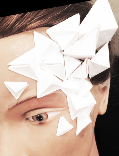
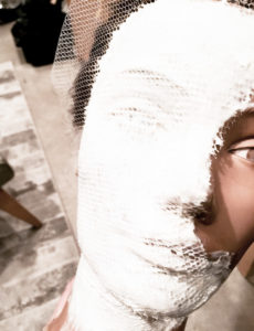
I bought a few books… one on origami, one was an adult coloring book of patterns and one was on the art of folding paper into patterns. I watched hours of YouTube videos on origami and paper art. I visited my local craft store… so much more fun than SEPHORA. I bought more paper than anyone would ever need… and started playing. This was my first attempt at paper art on my trusty mannequin, Viola. Unedited… I want you to see what I truly go through during my process. This approach would not be acceptable. I needed to find something more refined.
ORIGAMI
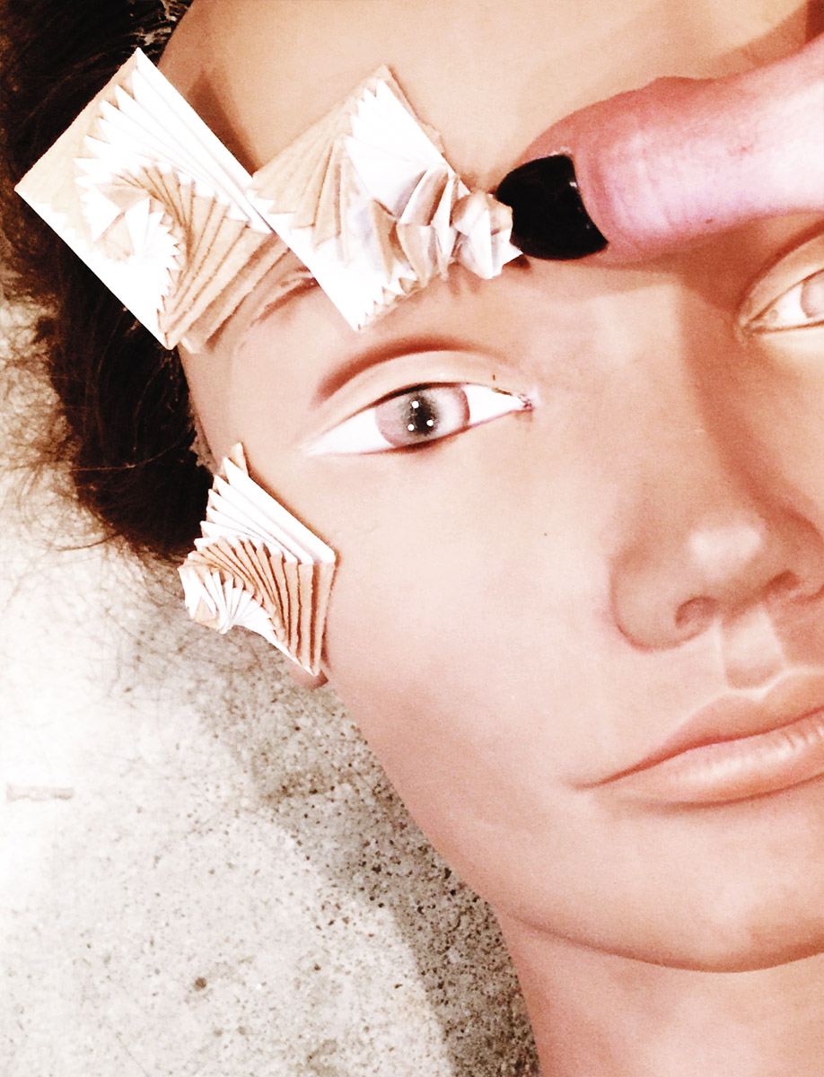
This next image is the origami paper art I finally arrived at. I used a form of origami called Curlicue. I learned this technique from a book with the same title. I opted to use paper that I use for die cutting makeup appliances. The reason I chose this paper is because it is paper on one side and vinyl on the reverse. I airbrushed foundation in between each layer of the swirling pattern and was able to wipe away the foundation sprayed on the vinyl, so the effect would be two-toned. Happy mistake.
CHOOSING THE RIGHT SHADE
Zeroing in on what shade of foundation to use was a different story. I searched the internet for all pictures I could find of Kiersey and chose a foundation shade that I thought would match her skin best. Paper absorbs darker… similar to the deepening that foundation experiences when it oxidizes on the skin. So I chose a shade two shades lighter than I believed her skin tone to be. Luckily I nailed it.
MASK MAKING
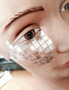
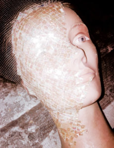
Another idea I was intrigued with was the tall glass buildings of Neo Modern architecture. I found this great pastel, oil slick vellum at the craft store and thought it could reflect light similar to mirrored glass if cut into a pattern. I created a quick grid pattern in photoshop and loaded the vector file into my die cut machine software. I cut the vellum into tiny squares that could be used for a mosaic. The far left image was my first attempt at adding the reflective foil to the skin using liquid latex.
LIQUID LATEX
This middle image above is Viola wet with liquid latex while we wait for the mask to cure. I find creating pieces on a mannequin is key to getting my makeup appliances to lay with the curve of the face. In a perfect world I would have had a cast of Kiersey’s face to build the piece on. That never happens however, so this technique is my alternative.
What you see above is two layers of liquid latex applied directly to my mannequin’s clean face. Followed with a piece of tulle and another two layers of liquid latex. Each layer is allowed to dry. You know it’s dry when it isn’t white and you can see through it. I then peeled away my mask to ensure I didn’t disturb my mosaic after it was applied.
I loosely tacked the mask back to Viola to build the mosaic. The far right image above shows the mosaic effect. Each tiny square is hand laid and adhered with a dot of liquid latex on the back side. I was so happy I opted for the route of a pre-made piece. I was naive to the time it would take me to create the finished piece. Whew!!
WHAT I LEARNED
This test produces two major discoveries. First… there was no way I would be able to create this look by hand on the day of the shoot… meaning I would need to pre make a piece that could be adhered to the face. Second… due to the curvature of the face the squares needed to be placed on a diagonal plane, not a vertical or horizontal. I noticed that laid vertically, the curves of the face fought with the design. When the design was laid diagonally, the pattern would taper around the jaw line easily and would be more aesthetically pleasing.
PAPER BIRD
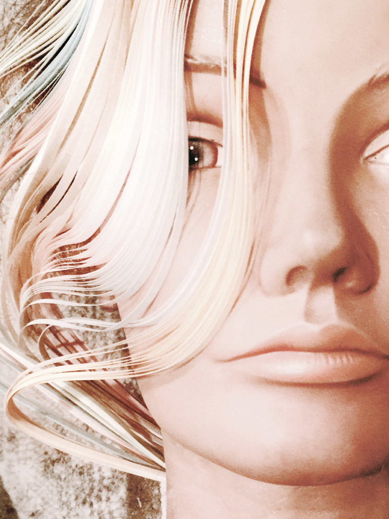
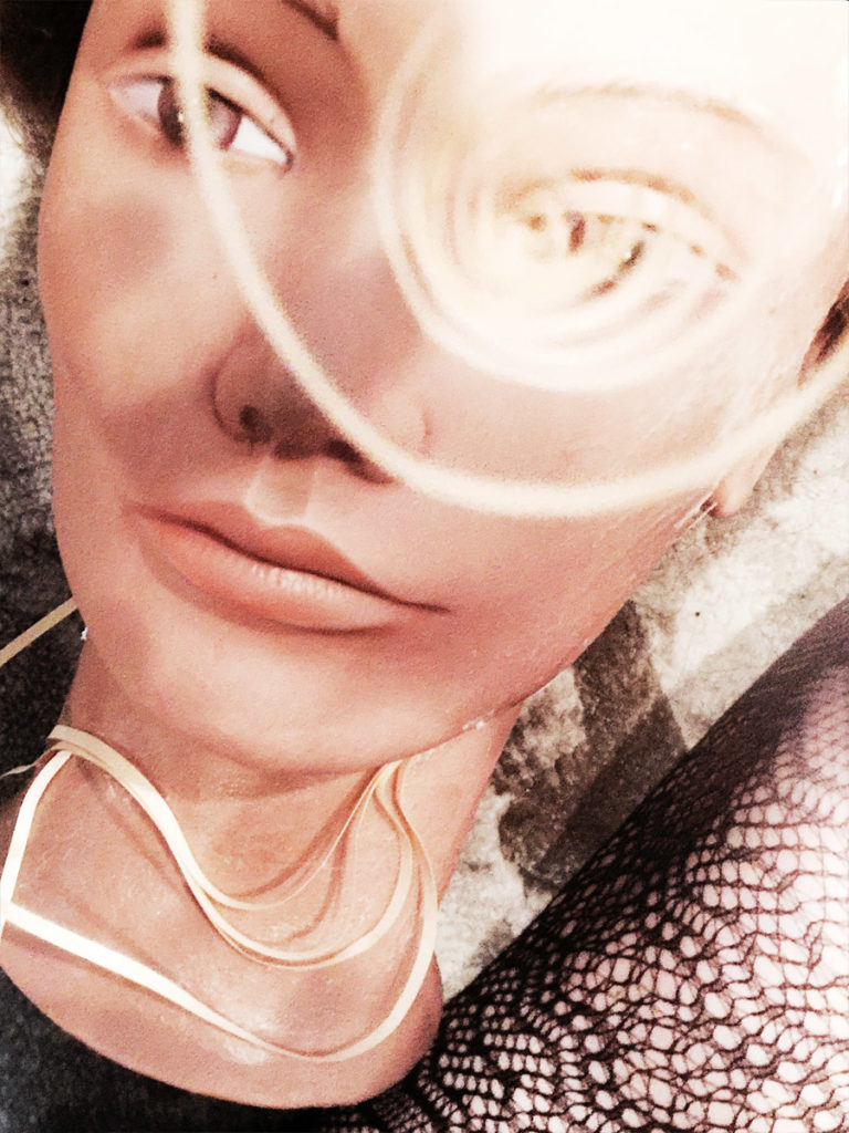
In an attempt to find a couple looks that could be changed easily on set, I experimented with this really cool package of paper strips adhered at both ends. I tried different ways of laying the paper strips across the face and photographed them to see how it would read.
The shot above on the right gave me an idea!! How simple… a spiraling strip of paper centered around her iris could be really beautiful. A tight macro shot of an eye with this effect could be really cool. I added it to the shot list and was happy that at least one of the shots wouldn’t take much to achieve.
DIE CUT MAKEUP APPLIANCES
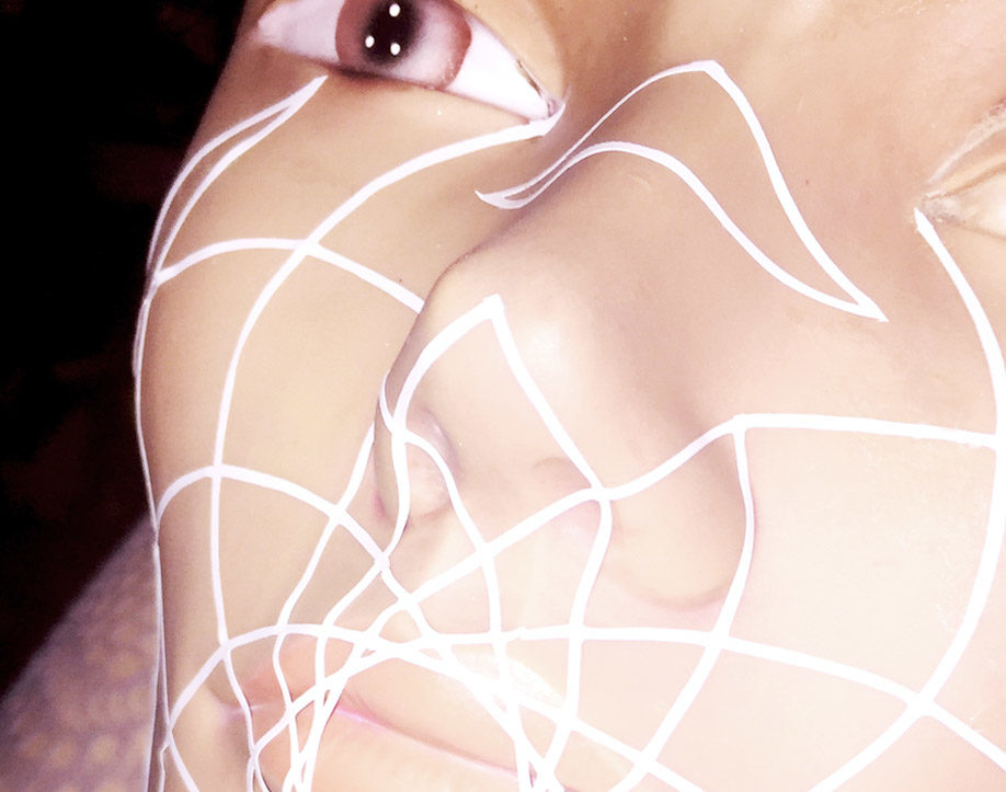
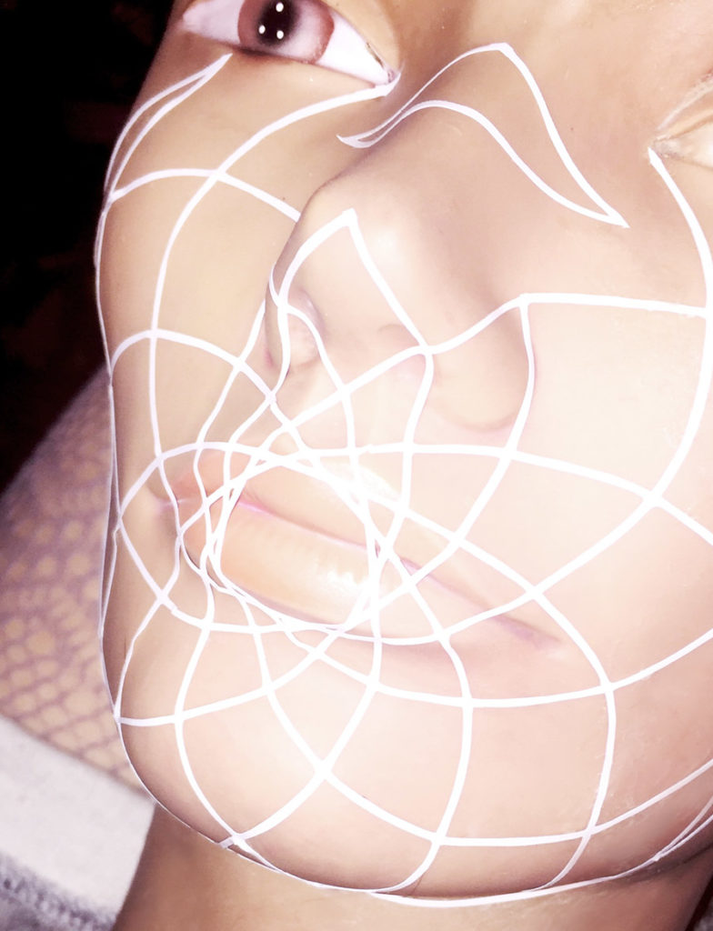
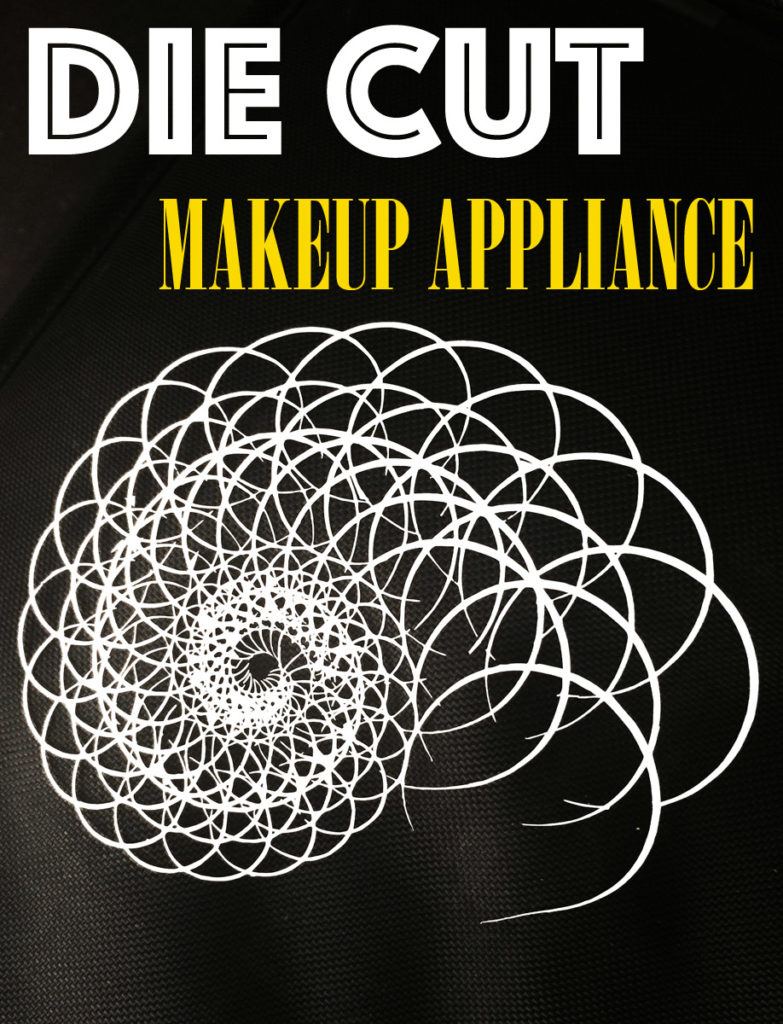
Of course… I had to break out the die cut machine for a couple of the looks. The image below on the left was my first attempt at a die cut makeup appliance for this project. Ultimately, I decided against this pattern, but looking at it now makes me want to shoot it. I arrived at two different graphic patterns that were cut prior to the day of the shoot.
Arriving stocked with pages of different patterns in a variety of sizes ensures I can custom fit my model’s face. I typically look for patterns that can be pulled from the page in one piece, although I’ve done it differently in the past. One piece patterns make the application faster to apply. I also choose symmetrical patterns that have curve. Curved patterns lay on the face better than square or rectangular patterns due to the curvature of the face. I learned that the hard way.
The image above on the right is one of the actual pieces I used for Kiersey. It is a gorgeous pattern that felt organic and modern at the same time. This is a die cut adhesive vinyl that sticks to the skin and is easily removed. Success!!
NEXT TIME ON MAKEUP MEETS TECH
Stay tuned in for Part 2 of my journey to get internationally published!! I will release behind the scenes images of Kiersey and the published beauty editorial in OOB MAGAZINE Issue #6. I’ve got a special surprise in the next post. Subscribe so you don’t miss a thing. And no, I don’t try to sell you stuff. Only the love of “all things tech” on this blog.
I invite you to SUBSCRIBE to MAKEUP MEETS TECH for posts that are all things tech. As always… I truly appreciate the likes, pins, shares and tweets. Join me on social for daily posts. For a makeup related tech post… check out Graphic MAKEUP Just Got Easier for a breakdown on how to use a die cut machine to create custom makeup appliances. I encourage comments and questions… we are all here to learn.

The strip paper look great! Excited to read about part 2! You’ve got me considering investment in a die cut machine for sure haha
Kimberly,
It was funny I bought a die cut machine as a need for perfect graphic liner for a show. I was really obsessing that the liner wouldn’t look the same on each model and because of my obsessive nature… I had to have them all identical. I would have never imagined at the time, that it would become my go-to tool for creating graphic effects. Unexpected for sure.